CANVAS DESIGN SYSTEM
Web (React) Library
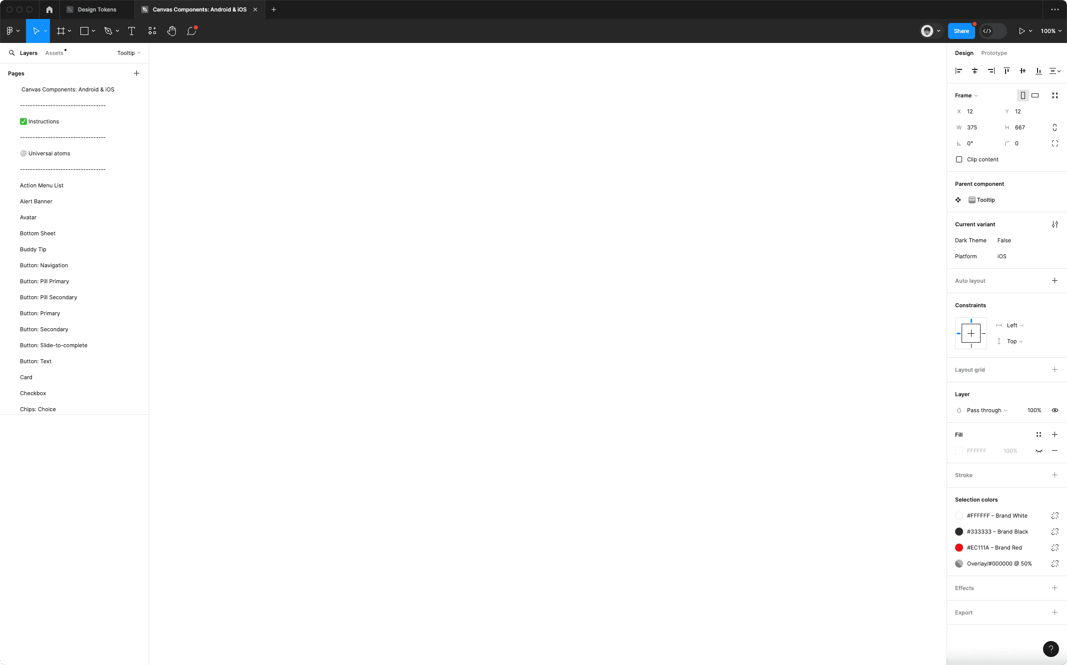
Android & iOS Library
Our team released two separated libraries for Web and Mobile components independent of each other. This offered designers a multitude of benefits, providing a smaller file weight, clear structure of libraries to focus on designers needs, easier data analytics tracking and optimized variant panel.
Parity between design and dev is our goal. We support all digital products in Scotiabank with multiple coding languages, including React, iOS UI Kit, iOS Swift UI, Android Kotlin and Android Jetpack Compose.
Digital teams are leveraging our libraries
Coding languages
Unique components are available to use
We have thousands of diverse Canvas users on a daily basis, such as journey team designers, developers and PMs. Documentations is critical to the success of our team by providing a how-to guide for using the design system effectively, and ideally, boosting the level of maturity and expertise of the partnering team members who use it.
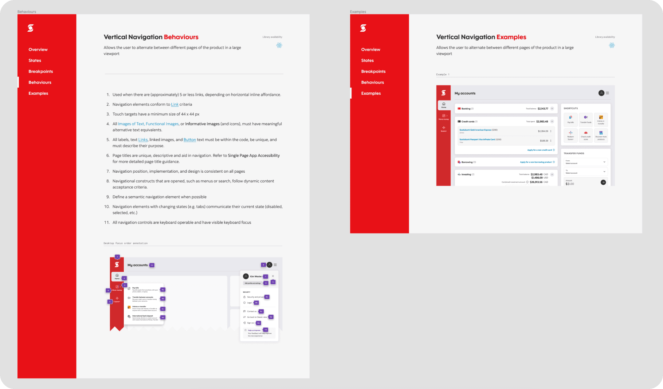
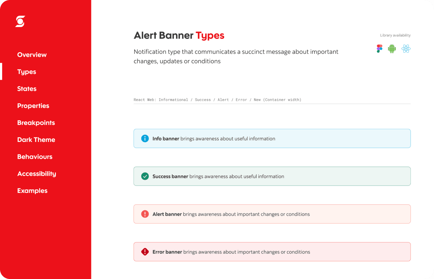
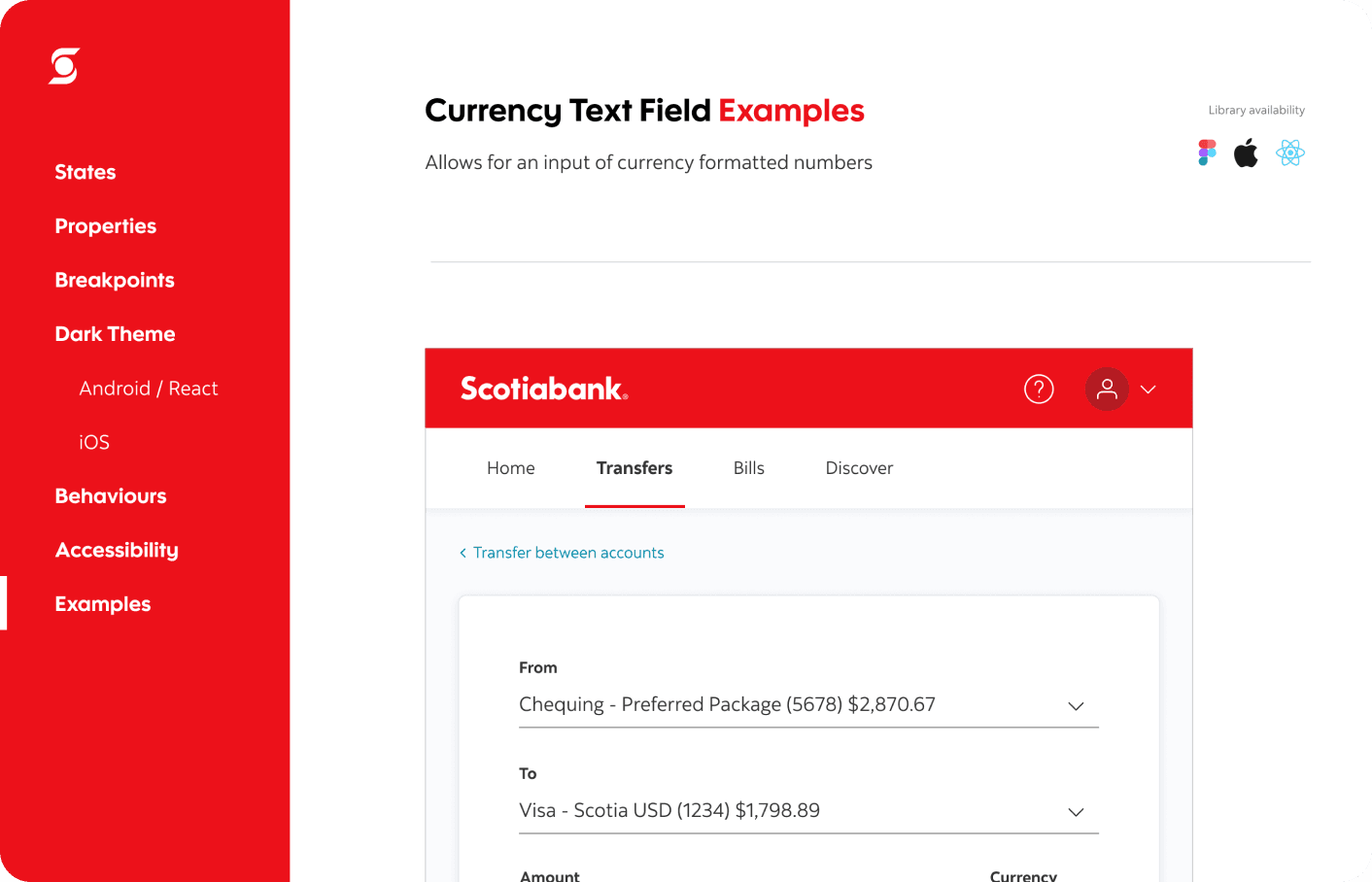
Our guidelines include but are not limited to accessibility, patterns, behaviours, usage, voice & tone, examples, etc.


Colour contrast
Keyboard controls
Z
X
Focus state
Button
Annotation kit
Screen reader
Love
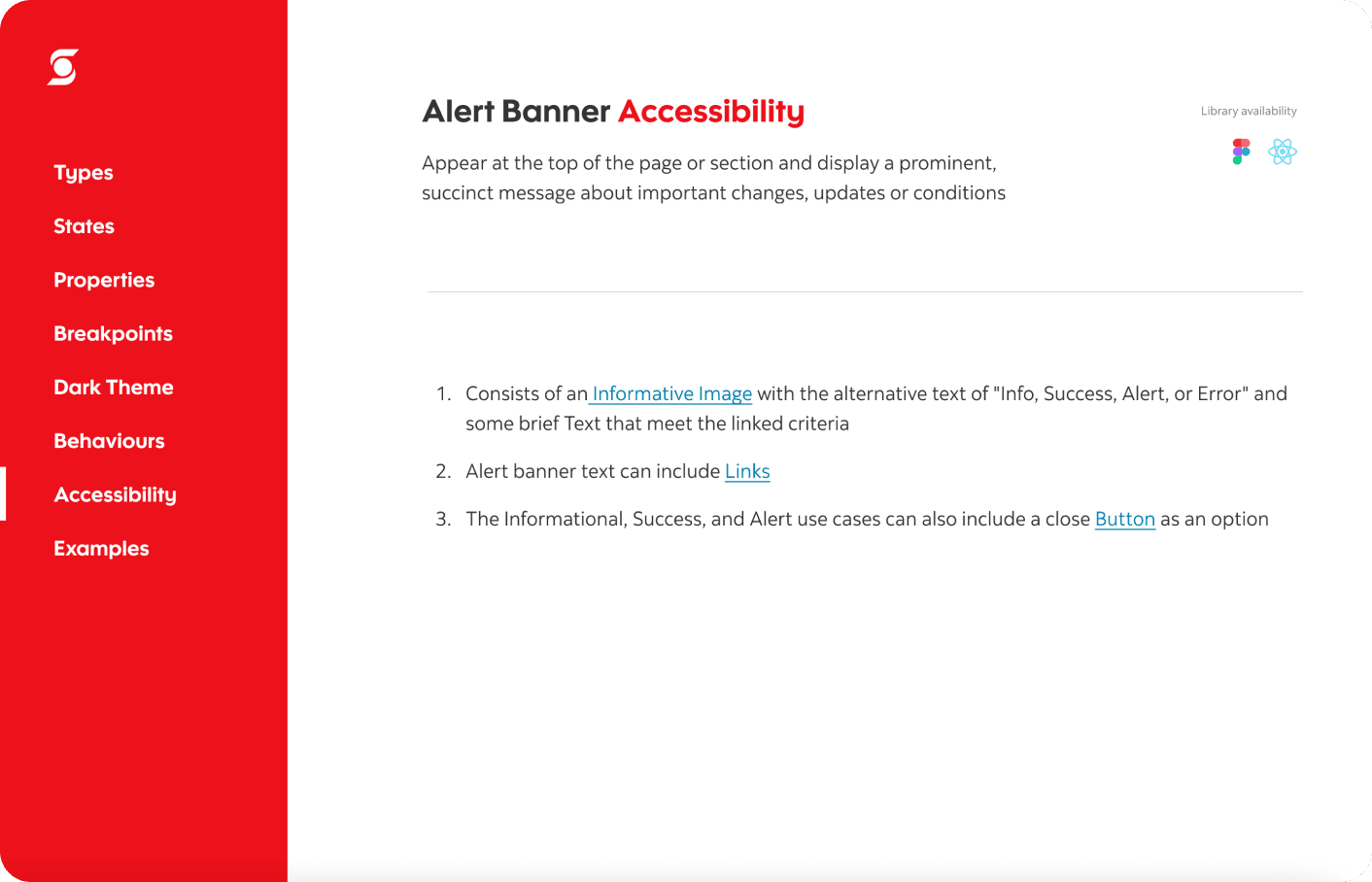
Canvas needs to meet a high standard for accessibility so all possible group of customers in Scotiabank can use our digital products. Scotia digital has an accessibility team to make sure all digital products fulfil latest requirements and our design system team has a dedicated accessibility partner in our creation process.
Accessibility in design system includes many different aspects: sufficient colour contrast ratios, keyboard controls, screen reader, focus states, documentation with annotations and so on. Canvas embedded accessibility criteria within the Figma documentation for each component and elevate awareness around designing accessible experiences with clear guidelines.
Collaboration flow
Component checklist

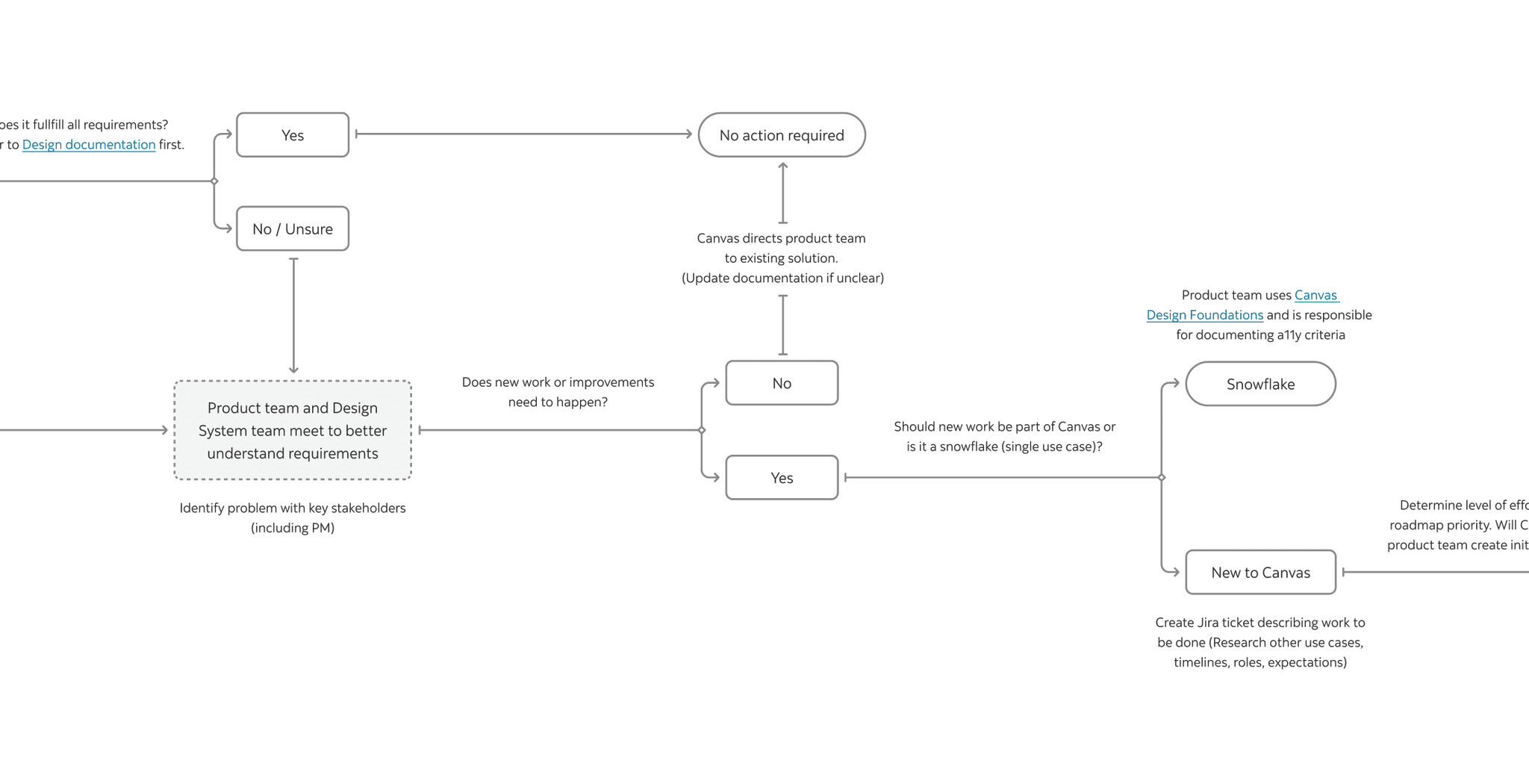
Given the limited resources of a design system team, Canvas leverages the contribution model to grow the library in a more efficient way. We promote inner-source in our design and dev community. In that way we can effectively bridge the gap between our existing components and any other patterns that we can serve for product teams.
Contribution is also a key OKR for our team success. Instead of being a separate team that builds and maintains the library independently, we see ourselves as an extension product team that ensures governance of quality and system thinkings. We designed a smooth collaboration flow and contribution guideline to empower as many product teams as possible and to allow Canvas to scale with the growth of the bank.
Internally Canvas team has weekly design syncs to stay informed on what each other is working on and to jam on solutions together.
We partner with different journey teams in different ways. We have a dedicated Slack channel where we offer cross-functional support. This is generally the quickest way to ask questions and get in touch with us.
We also hold weekly Open Office Hours where designers can sign up for assistance. Our design system team members try to attend relevant product team open sessions to stay informed of what our design partners are working on and what has been productized. More importantly, we can coordinate efforts strategically across product teams.


(1)
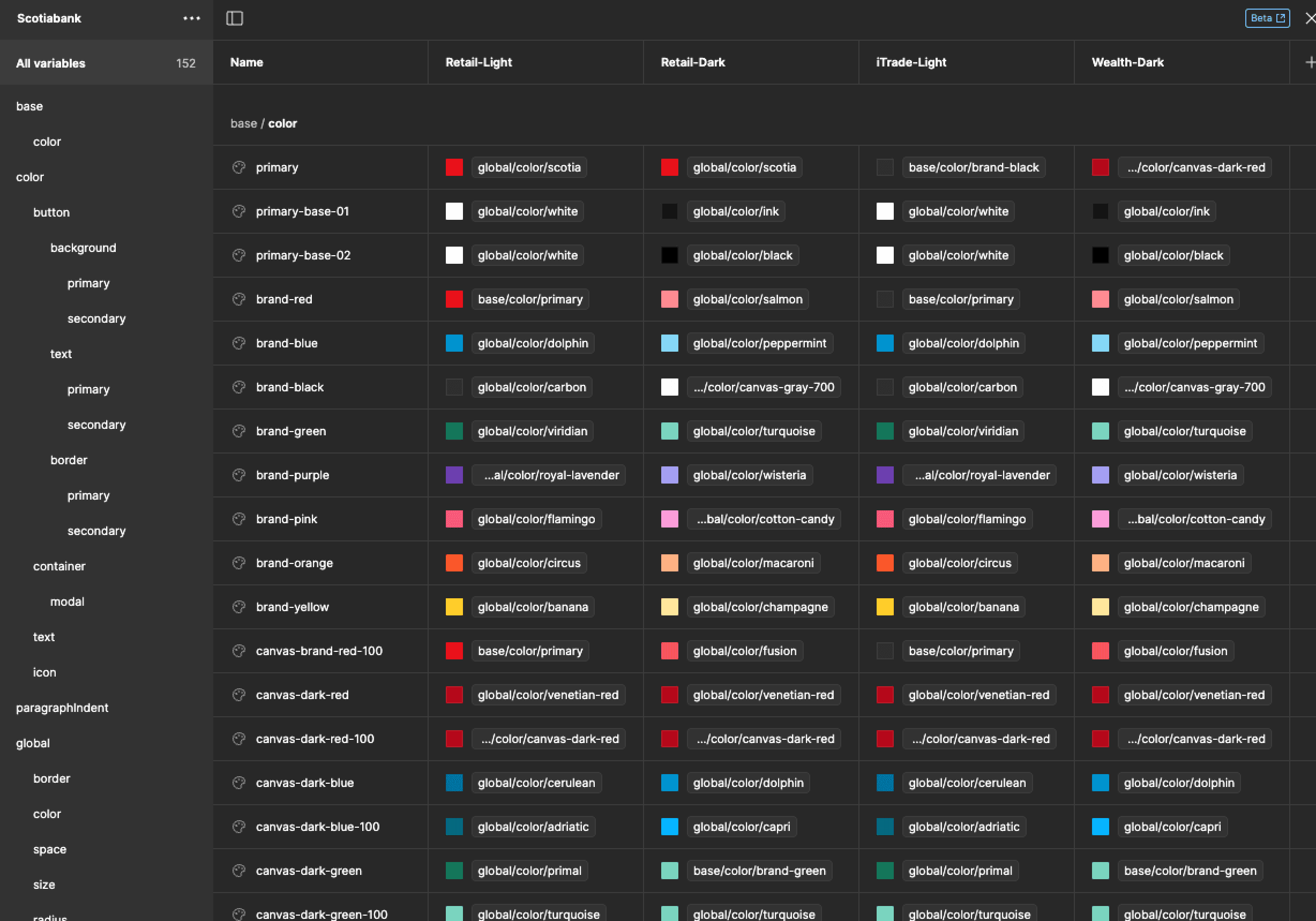
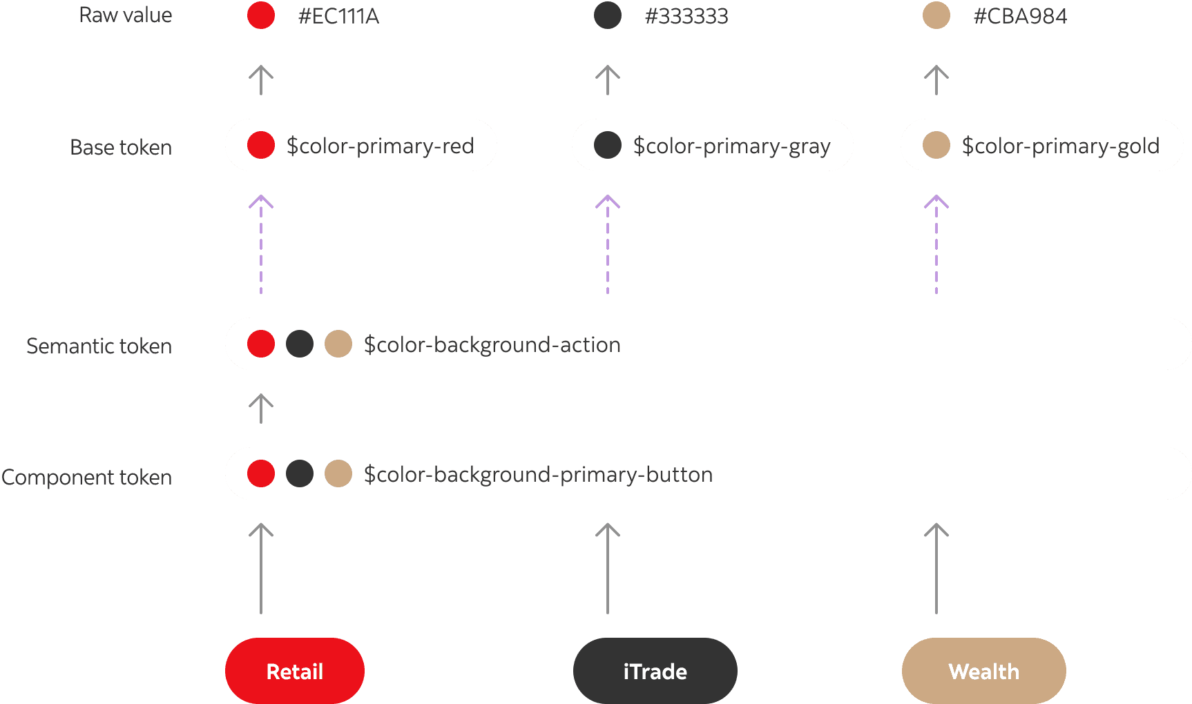
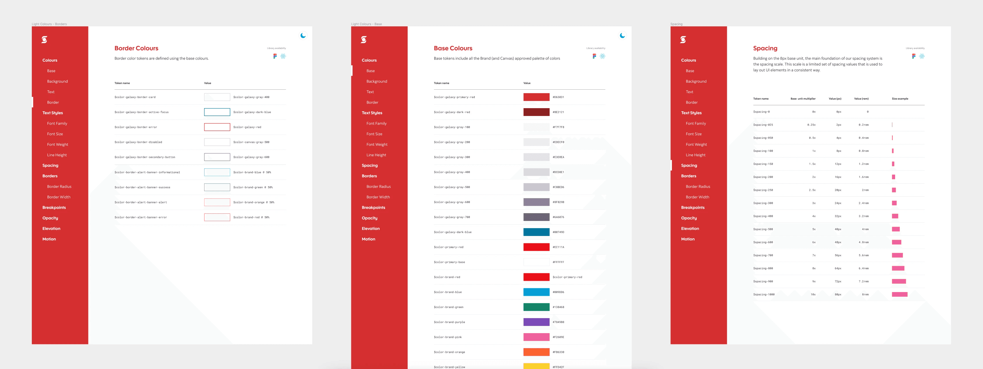
Set up design tokens to enable easy theme switching
In 2023, Figma has released a major update that allows designers to create variables, which enable design tokens being natively used in Figma.
Canvas is the ideal platform for implementing design tokens, especially considering that Scotiabank offers a variety of products across distinct themes, including retail, wealth management, and iTrade. Establishing a robust design token structure enables us to effortlessly switch between themes and enhances the efficiency of component development.