CS Design System
CS Design System
CS Design System
Building a new Design System from scratch in Figma, to create a scalable, consistent and accessible digital experience.
Building a new Design System from scratch in Figma, to create a scalable, consistent and accessible digital experience.
Building a new Design System from scratch in Figma, to create a scalable, consistent and accessible digital experience.
Company
Credit Suisse
Company
Credit Suisse
Company
Credit Suisse
Tools
Figma
Tools
Figma
Tools
Figma
Role
Owner & contributor
Role
Owner & contributor
Role
Owner & contributor
Deliverables
Design library
Component guideline
Design token
Deliverables
Design library
Component guideline
Design token
Deliverables
Design library
Component guideline
Design token

Overview
Since joining Credit Suisse as a Product Designer in the Visual & Interaction team, I have had the opportunity of spearheading the development of the Wealth Management Design System (WMDS). This comprehensive system is currently leveraged by over five digital products within the wealth management domain, encompassing both client-facing applications and internal tools. These include the digital private banking app, the internal insights CMS, and the RM trading platform.
The process of building a Design System can be effectively organized using a double-diamond model. Initially, I embarked on finding the appropriate problem to address by conducting extensive research on current practices and conducting one-on-one interviews with various product teams. Once a comprehensive understanding of the situation was achieved, an execution plan was devised, encompassing the structuring of the WMDS and the timeline for the delivery of each component level. While the foundation, atomic, and molecule-level components were released incrementally, the team actively encouraged feedback and questions to enable timely iterations and improvements to the system.
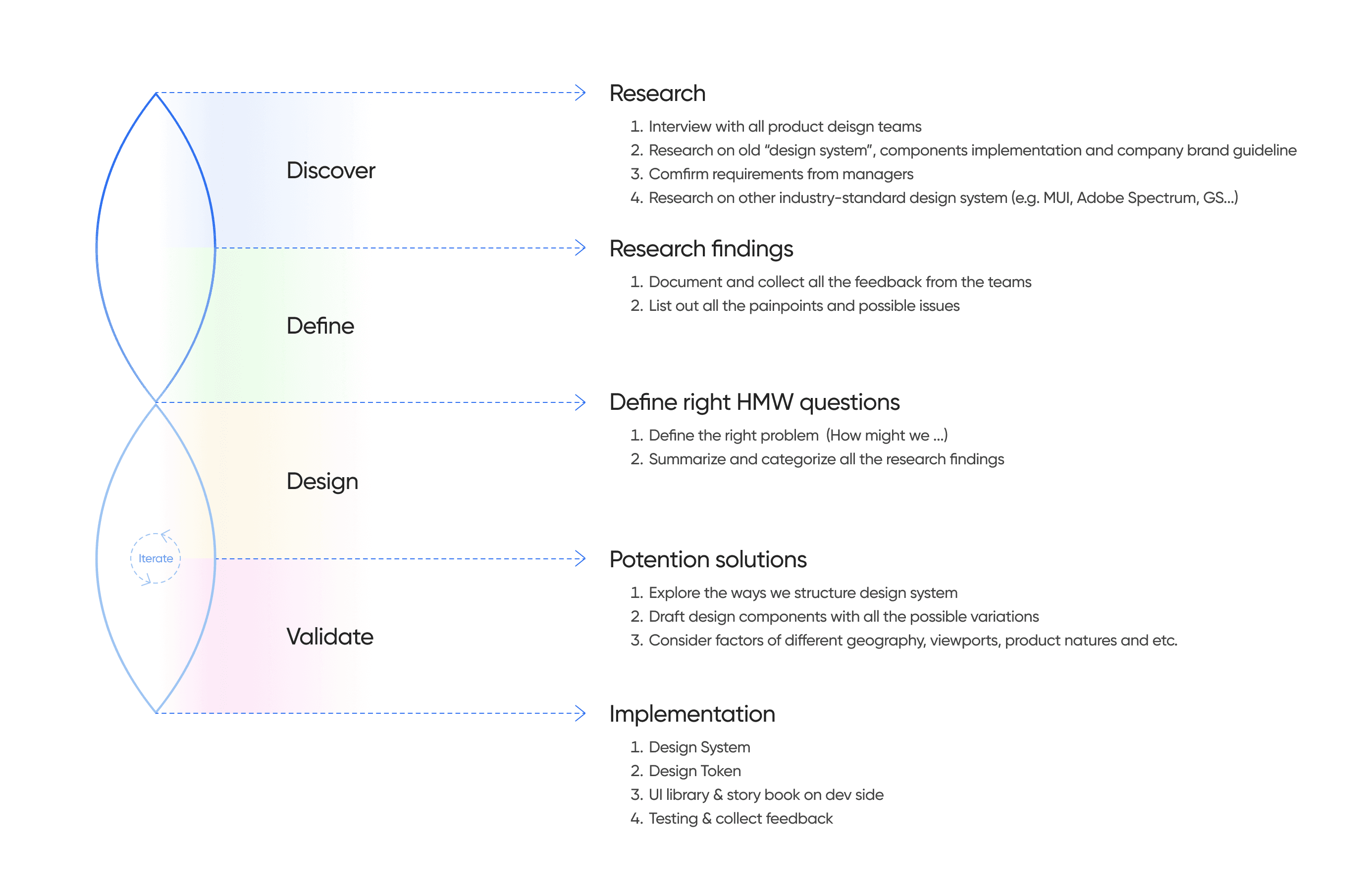
Discover & Define
Beginning with the discovery stage, my objective was to uncover the precise problems that users of WMDS were facing, as well as their needs and pain points when utilizing the current practices.
To accomplish this, I conducted interviews with over 3 design teams responsible for various digital products within wealth management, gathering valuable insights from both designers and front-end developers.
It would be better to align components style in different products.
UI Designer from Product C
There’s always padding/spacing inconsistency between screens and journeys. We don’t know which one we should follow.
Front-end Developer
I have no idea which components are ready to use. And where should I raise if there’s new components needed?
New-join UX Designer
I don’t know which is the correct assets to use - too many libraries at the same time.
UI Designer from Product A
When preparing user testing, I need to set up all the interactions manually for some commonly used component, like checkbox and radio, which is time-consuming.
Researcher from Product B
We hope design team can provide clear guideline on different states of a component, including edge cases.
Front-end Developer
The existing design system is messy and full of unrelated explorations.
Senior UX Designer from Product A
Here's our challenges …
Concurrently, through thorough research of existing brand guidelines and design files, I gained a better understanding of the challenges the team was experiencing:
There was confusion among designers as multiple libraries were available simultaneously, making it difficult to determine which components were correct to use.
Designers resorted to building components in separate local design files due to uncertainty regarding their reusability across different projects.
There was a misalignment between design and production, as clear guidelines were lacking for various states, behaviors, interactions, and use cases.
The existing design system was not sufficiently organized, making it challenging to easily search for specific components.
There was a lack of clear product design instructions in the global brand guideline, which predominantly focused on printed materials, PowerPoint presentations, posters, and reports.
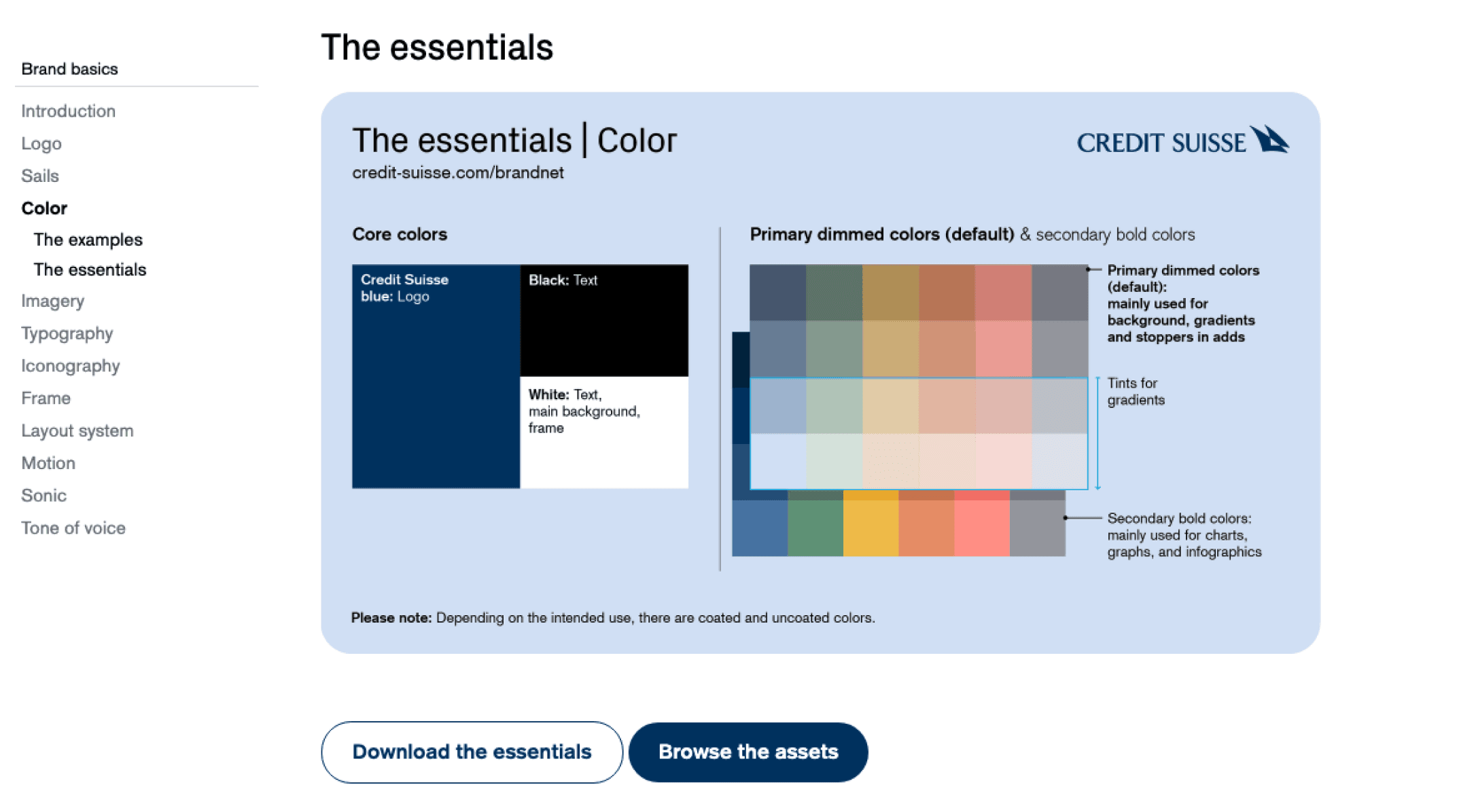
Brand guideline
Problems to solve
Problems to solve
To summarize the findings by "How might we" questions
To summarize the findings by "How might we" questions
How might we
structure and organize the design system so that users can easily find out the correct components to use?
How might we
structure and organize the design system so that users can easily find out the correct components to use?
How might we
apply interaction in design system to help better visualize the real product in prototype and user testing?
How might we
apply interaction in design system to help better visualize the real product in prototype and user testing?
How might we
create a design system applicable for all the products under wealth management?
How might we
create a design system applicable for all the products under wealth management?
How might we
create a design system applicable for all the viewports?
How might we
create a design system applicable for all the viewports?
How might we
deliver a clear guideline to developers so that there will be no misalignment between design and dev?
How might we
deliver a clear guideline to developers so that there will be no misalignment between design and dev?
Design & Validate
Prior to commencing the design phase, I formulated a concise plan and established an estimated timeline. This served to assist senior management in visualizing the prioritization of resources and setting expectations regarding the subsequent steps and the anticipated final outcome within a specific timeframe.
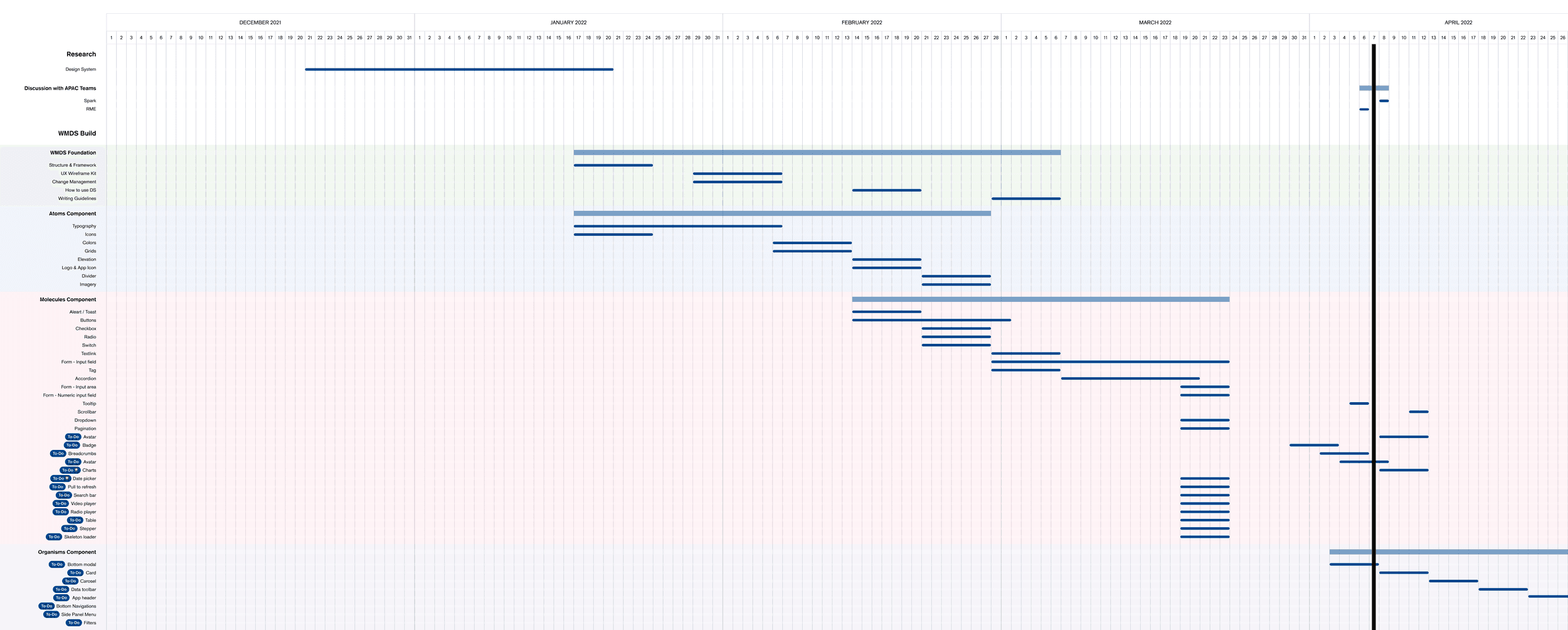
2022 Design System Roadmap & Planning
Configurable
Designers can now effortlessly and intuitively configure components within Figma.
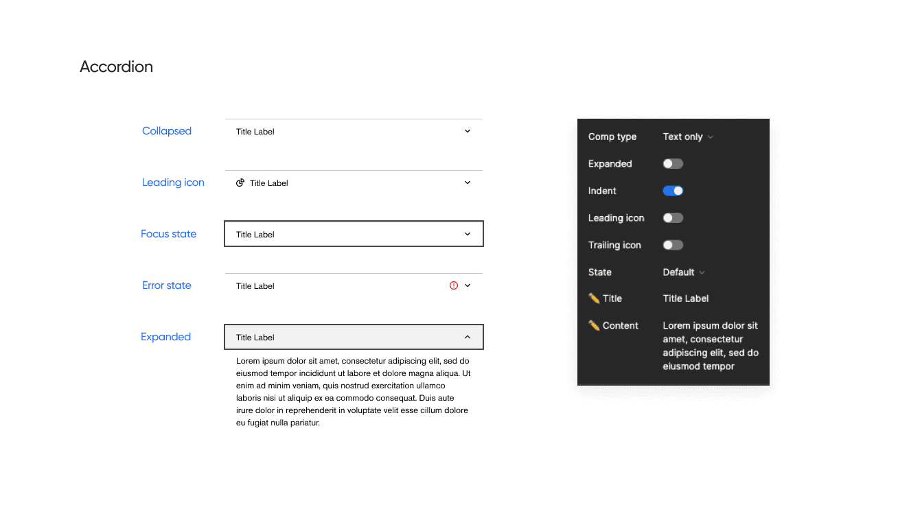
For instance, when working with an accordion, designers can readily access the desired variations through the variant panel. With the optimization brought about by Config 2022, which includes the ability to set boolean and text properties, designers can conveniently configure all component variations from a centralized location.
Scalable
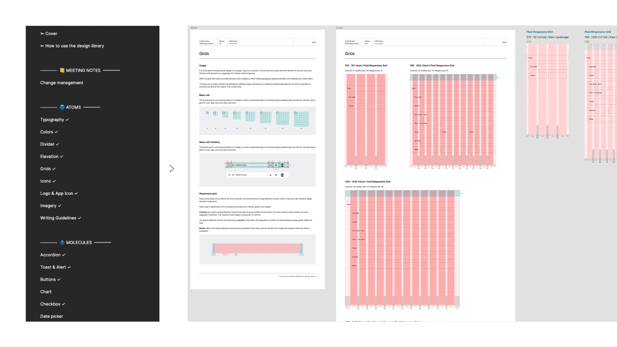
Thanks to a meticulously established auto-layout system, all components within the design system are now seamlessly scalable across various viewports. From mobile (375px) to tablet (768px), desktop (1024px), and even ultra-wide screens (1440+px), designers can effortlessly utilize the components to create UIs of any desired screen size.

Interactive
Presenting the design to various stakeholders holds significant importance for designers. Utilizing a more realistic prototype can greatly enhance their ability to visualize and comprehend the concepts and ideas, particularly when accompanied by detailed micro-interactions.
One standout aspect of WMDS is our comprehensive coverage of interactive states for all components, meticulously linked within the prototype. This integration ensures that when designers employ these components, the micro-interactions are automatically applied to the prototype, bringing the product to life and enhancing its overall appearance.
Universal
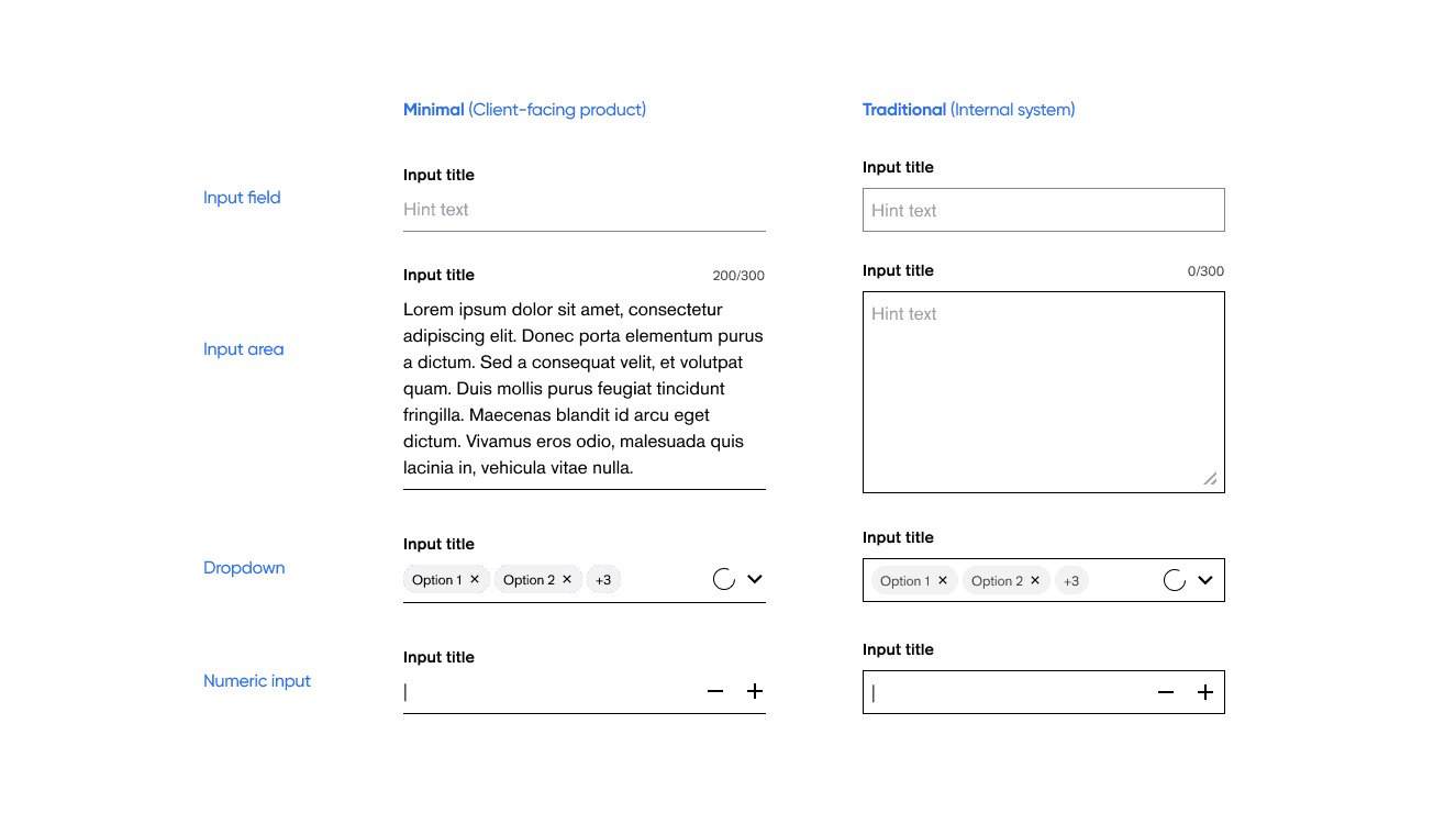
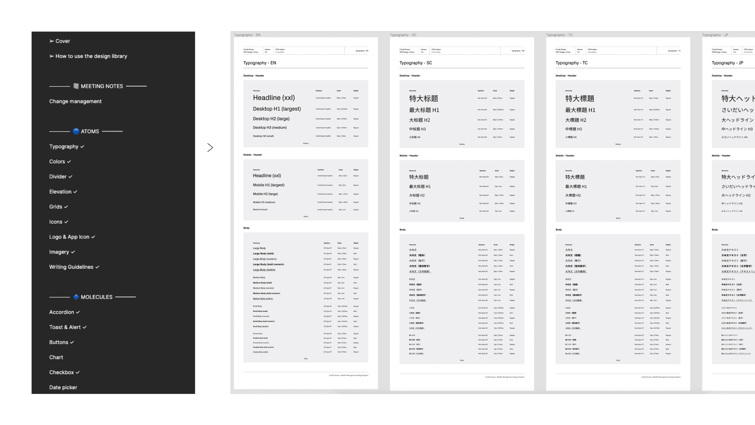
Given the diverse range of digital products within Credit Suisse, encompassing client-facing applications and internal systems, the design system not only addresses variations in styles but also offers two distinct options for designers to utilize.
Accessible
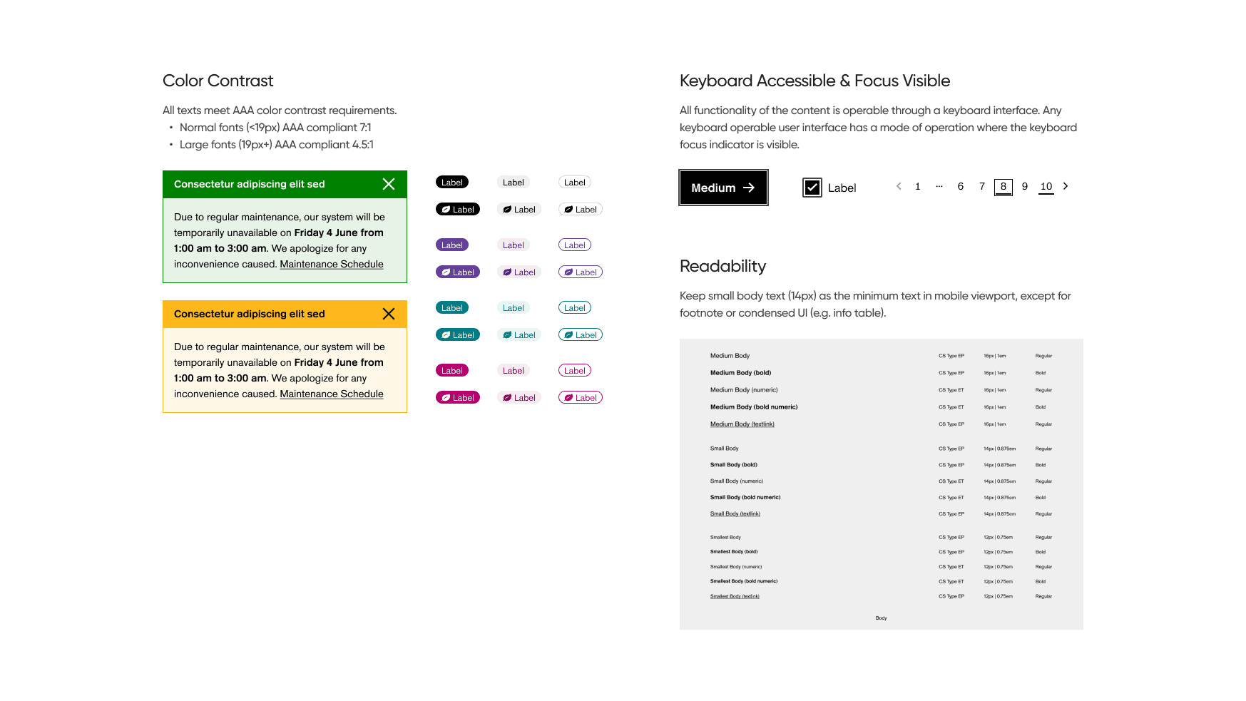
Ensuring accessibility is a paramount consideration during the development of WMDS. We adhere to the WCAG2 (Web Content Accessibility Guidelines) when designing the components, guaranteeing that they meet the necessary accessibility requirements prior to release. By doing so, we promote inclusivity and cater to the needs of diverse user groups. To achieve this, we conduct rigorous checks on color contrast, screen reader compatibility, keyboard accessibility, focus visibility, and readability before each release.
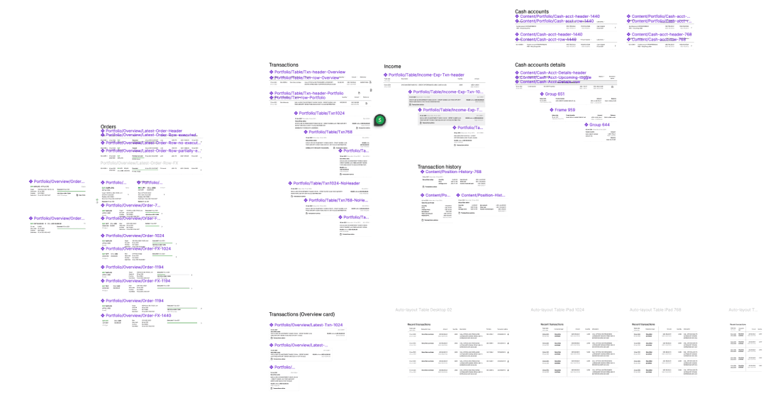
Design System Structure
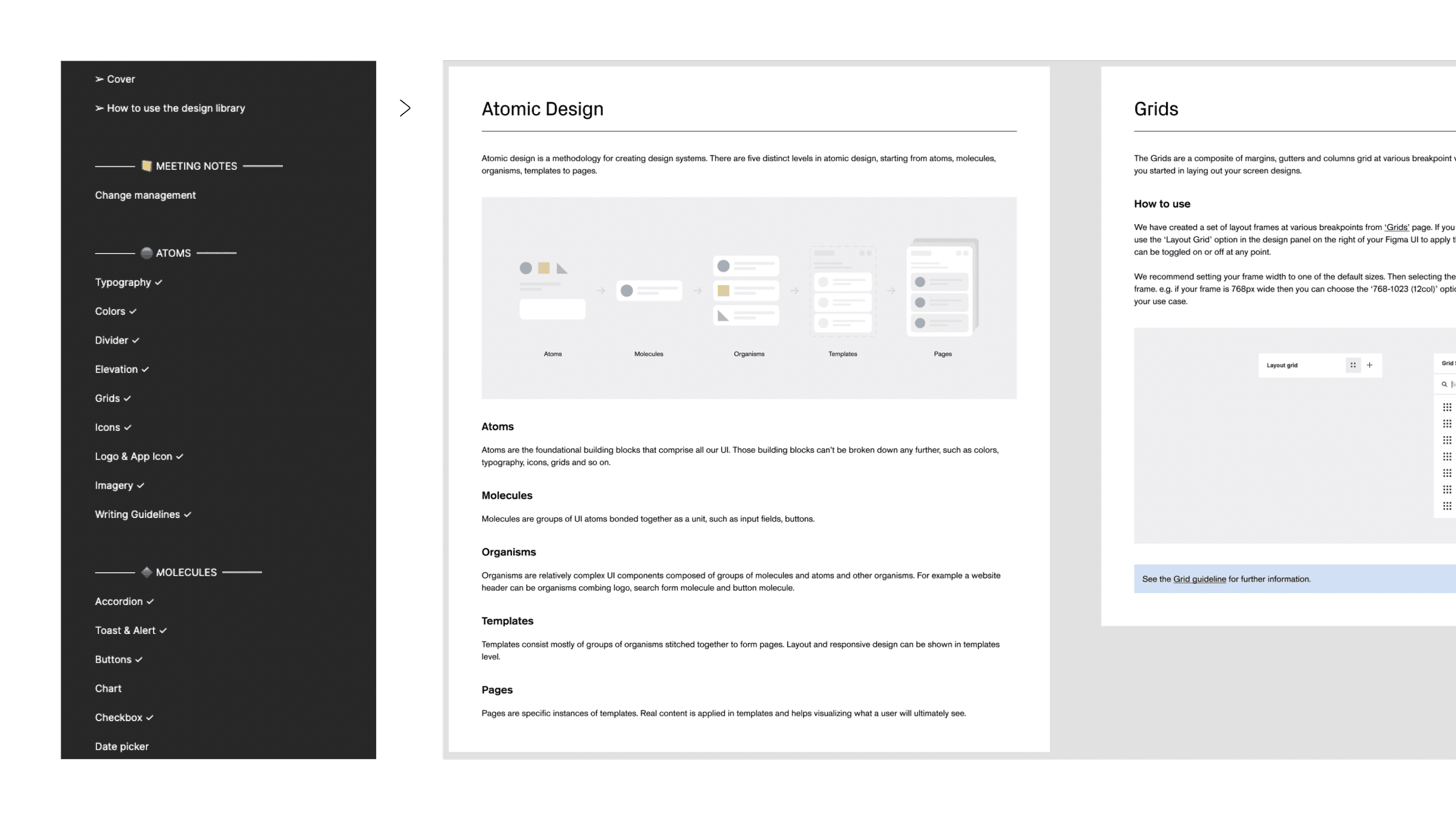
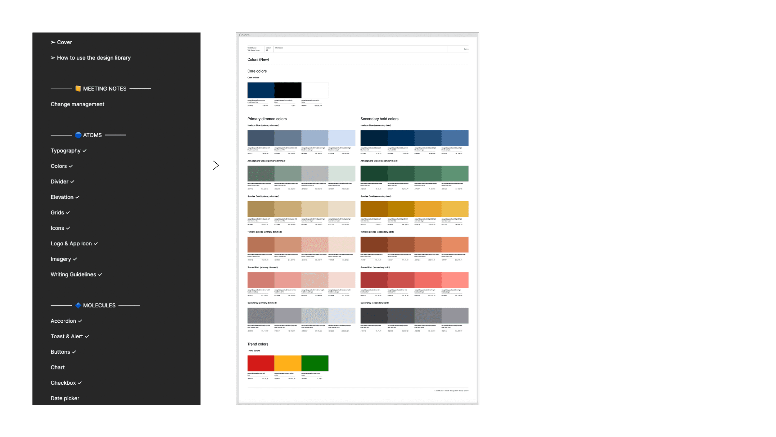
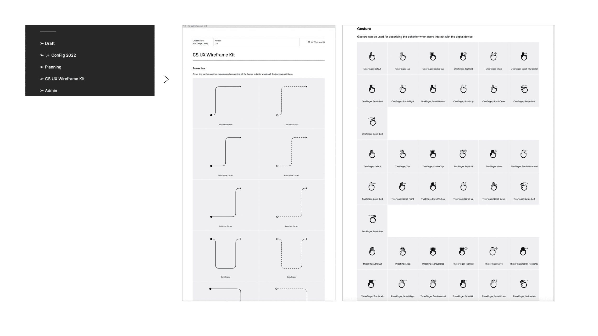
We have meticulously structured the content within our Figma master library, starting with a comprehensive guideline on system usage and the methodology employed to organize the system. Following the principles of atomic design, our library begins with atom-level components, followed by molecules, organisms, and so on. The final section encompasses additional supporting information, such as planning and timeline documentation, a UX wireframe kit, and component page framework controls. This organization ensures clarity and efficiency when navigating the library's content.

Design & Validate
Prior to commencing the design phase, I formulated a concise plan and established an estimated timeline. This served to assist senior management in visualizing the prioritization of resources and setting expectations regarding the subsequent steps and the anticipated final outcome within a specific timeframe.
Configurable
Designers can now effortlessly and intuitively configure components within Figma.
For instance, when working with an accordion, designers can readily access the desired variations through the variant panel. With the optimization brought about by Config 2022, which includes the ability to set boolean and text properties, designers can conveniently configure all component variations from a centralized location.
Scalable
Thanks to a meticulously established auto-layout system, all components within the design system are now seamlessly scalable across various viewports. From mobile (375px) to tablet (768px), desktop (1024px), and even ultra-wide screens (1440+px), designers can effortlessly utilize the components to create UIs of any desired screen size.
Interactive
Presenting the design to various stakeholders holds significant importance for designers. Utilizing a more realistic prototype can greatly enhance their ability to visualize and comprehend the concepts and ideas, particularly when accompanied by detailed micro-interactions.
One standout aspect of WMDS is our comprehensive coverage of interactive states for all components, meticulously linked within the prototype. This integration ensures that when designers employ these components, the micro-interactions are automatically applied to the prototype, bringing the product to life and enhancing its overall appearance.
Universal
Given the diverse range of digital products within Credit Suisse, encompassing client-facing applications and internal systems, the design system not only addresses variations in styles but also offers two distinct options for designers to utilize.
Accessible
Ensuring accessibility is a paramount consideration during the development of WMDS. We adhere to the WCAG2 (Web Content Accessibility Guidelines) when designing the components, guaranteeing that they meet the necessary accessibility requirements prior to release. By doing so, we promote inclusivity and cater to the needs of diverse user groups. To achieve this, we conduct rigorous checks on color contrast, screen reader compatibility, keyboard accessibility, focus visibility, and readability before each release.
Design System Structure
We have meticulously structured the content within our Figma master library, starting with a comprehensive guideline on system usage and the methodology employed to organize the system. Following the principles of atomic design, our library begins with atom-level components, followed by molecules, organisms, and so on. The final section encompasses additional supporting information, such as planning and timeline documentation, a UX wireframe kit, and component page framework controls. This organization ensures clarity and efficiency when navigating the library's content.
Design Token
In order to establish a scalable and consistent visual system for UI development, as well as manage visual design attributes in a systematic manner, I collaborated with a designer from the Design Ops team to devise a design token structure for Credit Suisse.

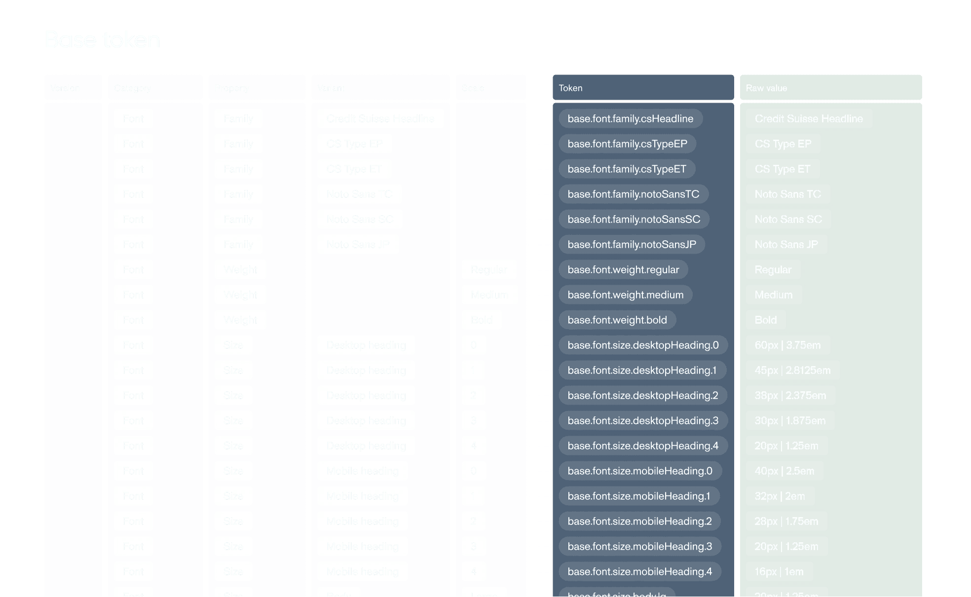
Base token
We began by creating base tokens to define all fundamental values, including colors, typography, and spacing.
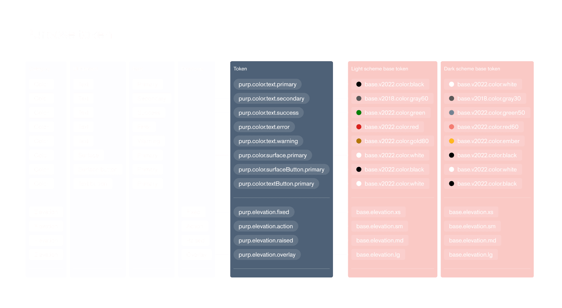
Purpose token
The purpose token is to systemize the design language for a specific theme or context. These purpose tokens effectively communicate the intended function of a token, particularly when a value with a singular purpose is used in multiple instances or locations.

Component token
The final type of token is the component token, which is the most specific one and represents the values associated with a particular component.
Design Token
In order to establish a scalable and consistent visual system for UI development, as well as manage visual design attributes in a systematic manner, I collaborated with a designer from the Design Ops team to devise a design token structure for Credit Suisse.
Base token
We began by creating base tokens to define all fundamental values, including colors, typography, and spacing.
Purpose token
The purpose token is to systemize the design language for a specific theme or context. These purpose tokens effectively communicate the intended function of a token, particularly when a value with a singular purpose is used in multiple instances or locations.
Component token
The final type of token is the component token, which is the most specific one and represents the values associated with a particular component.